
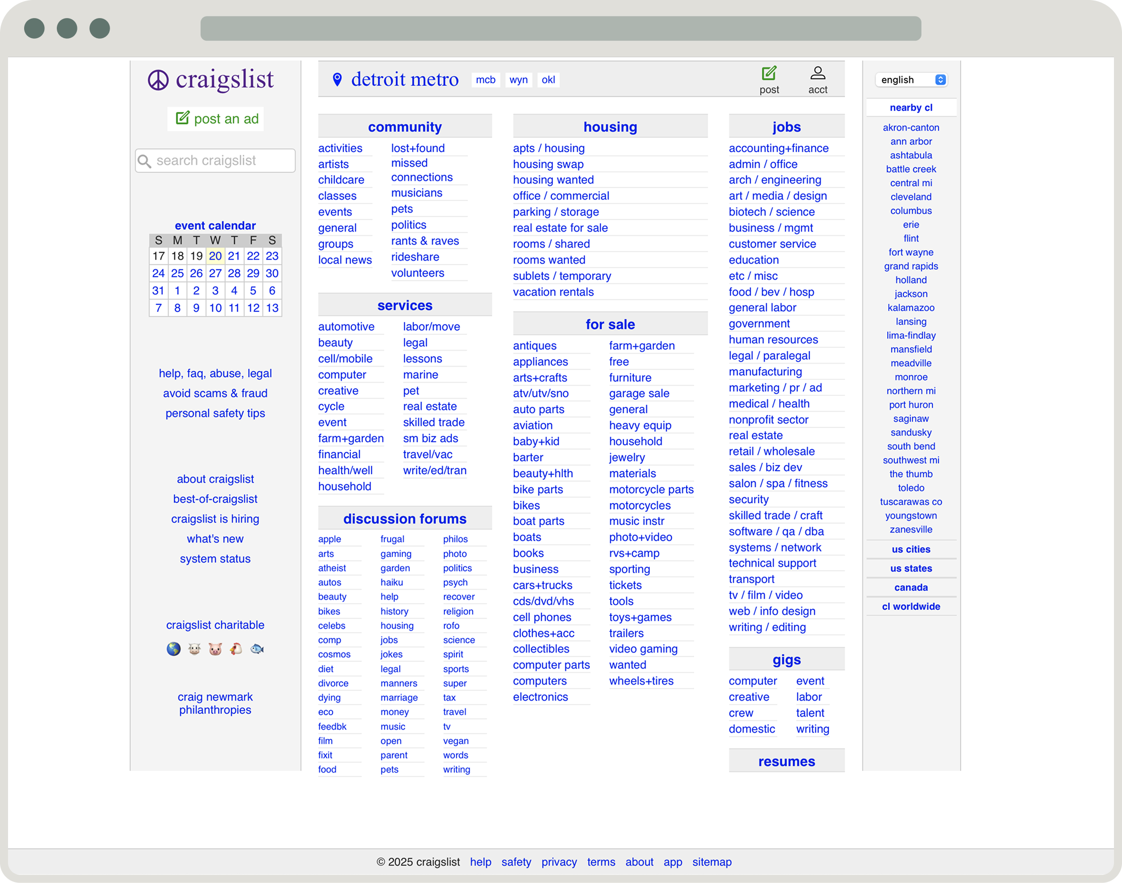
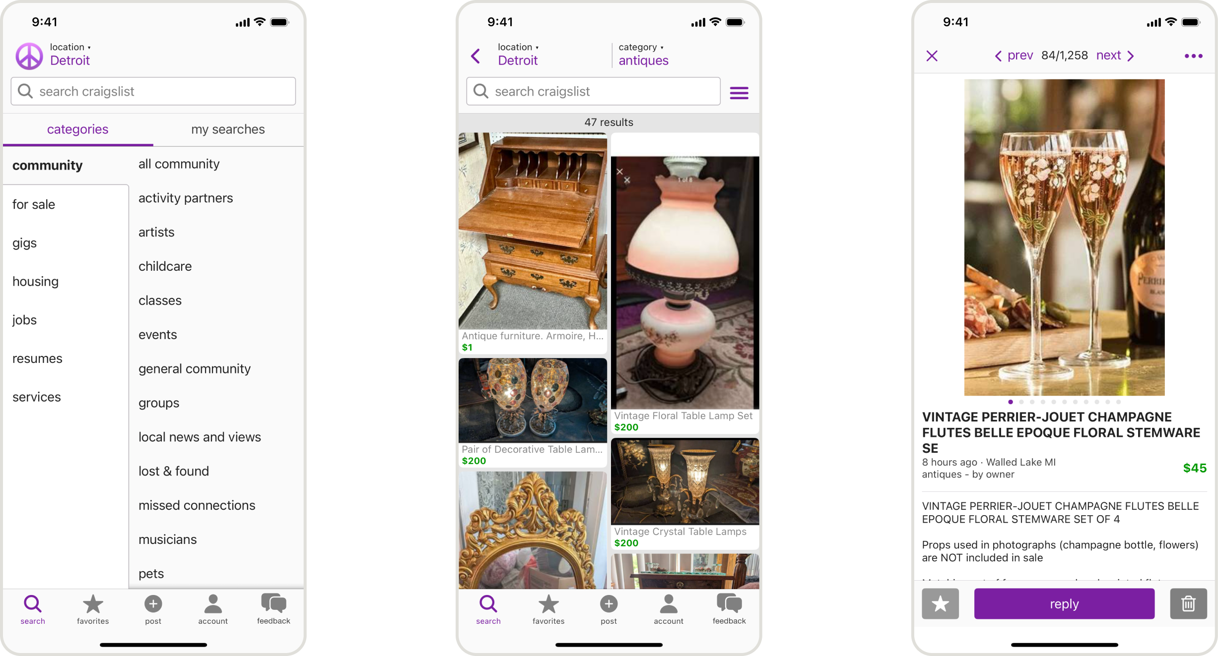
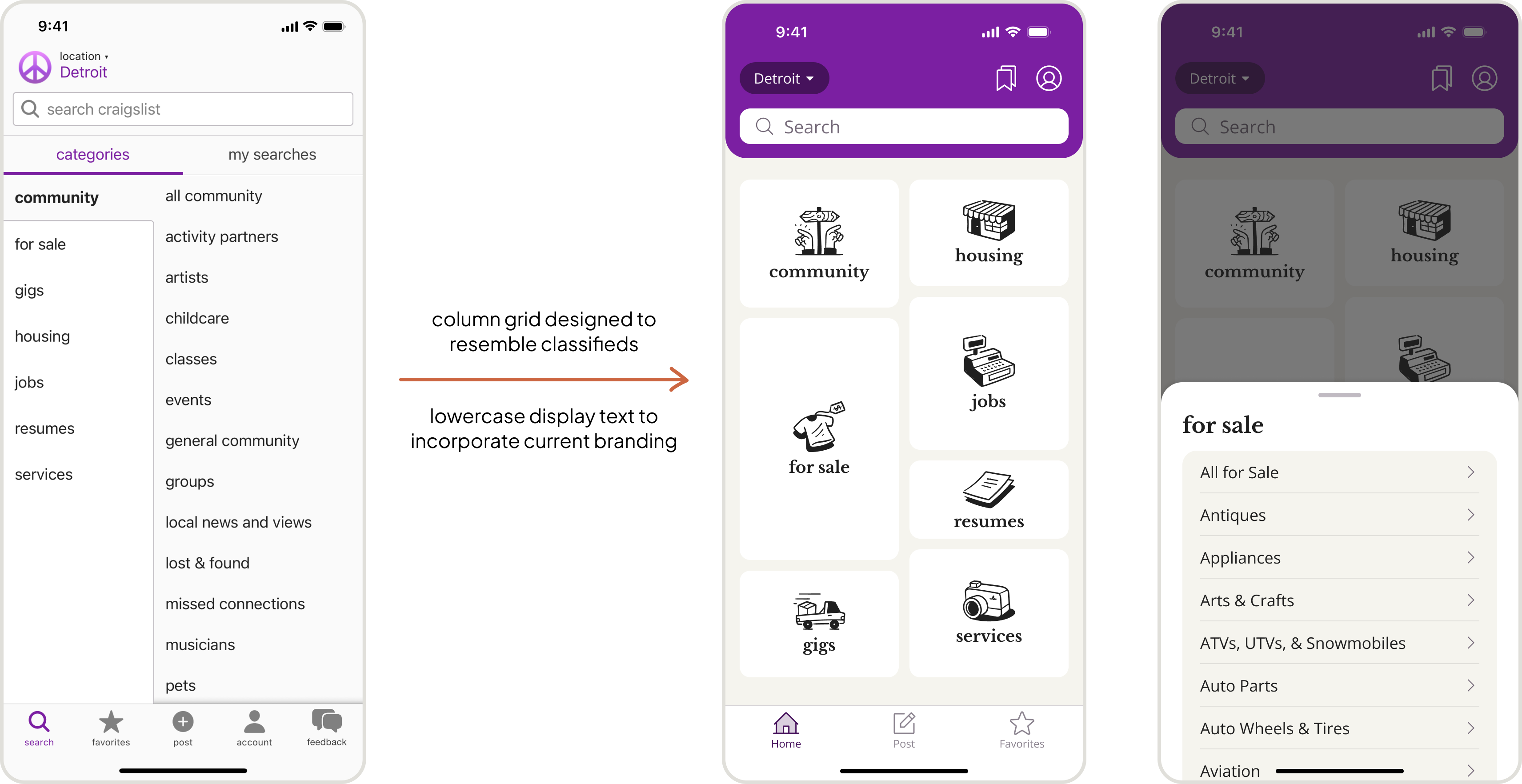
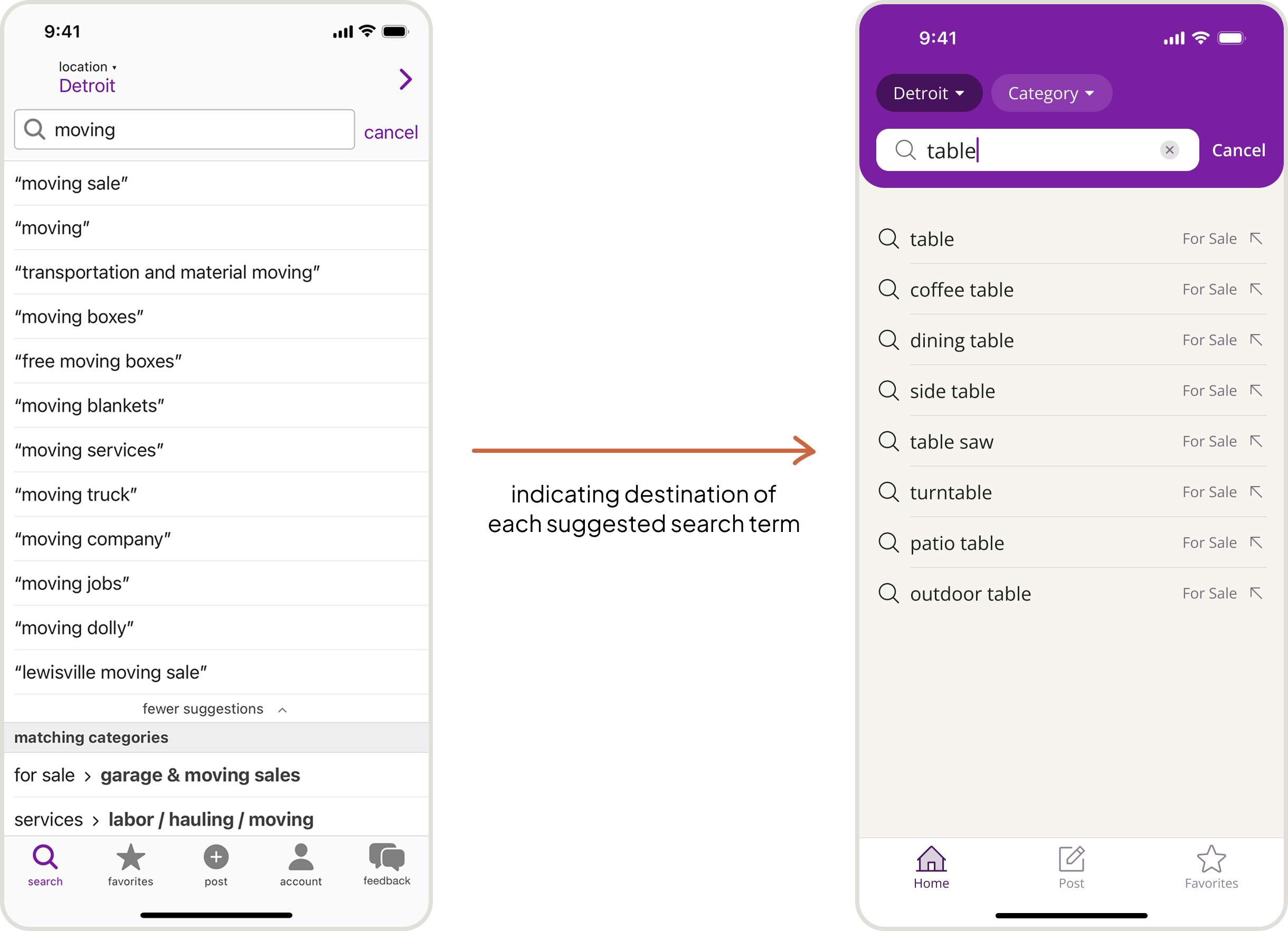
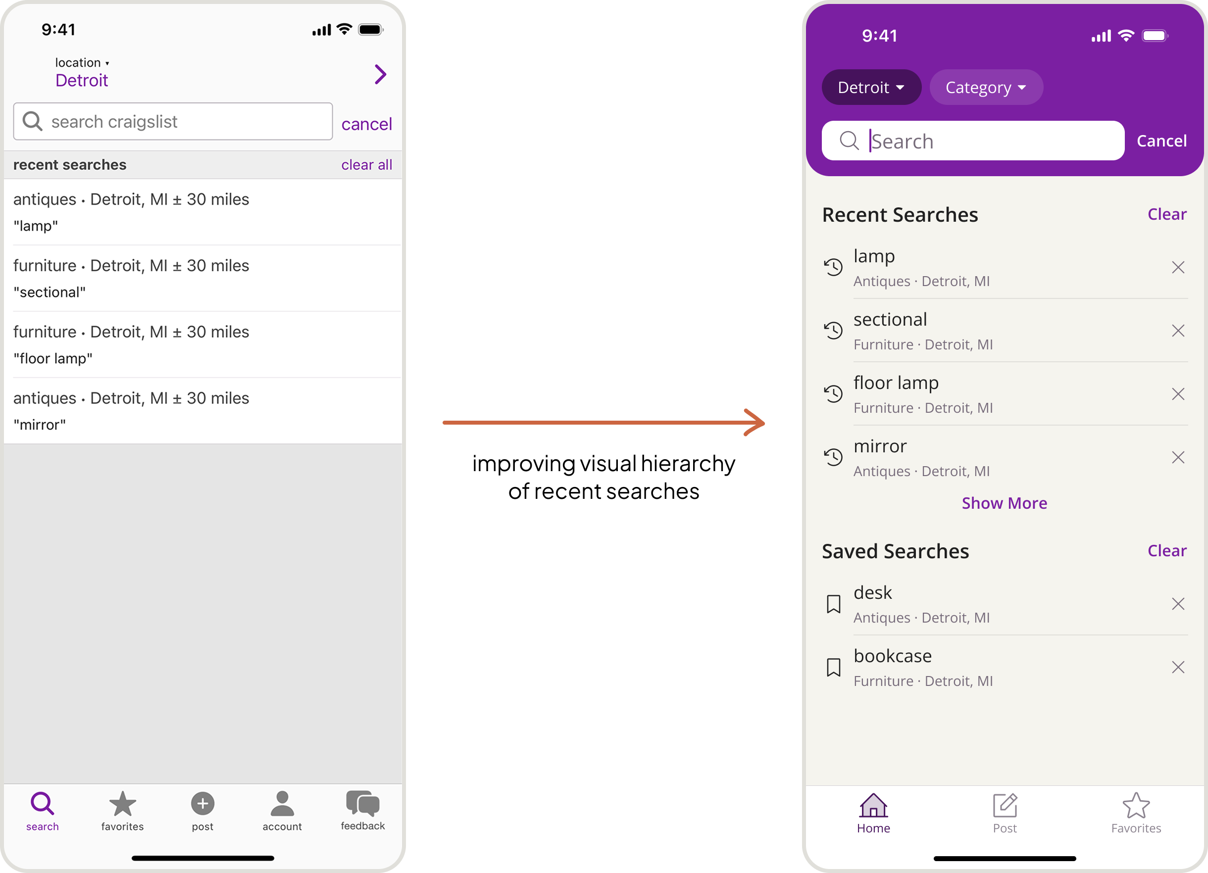
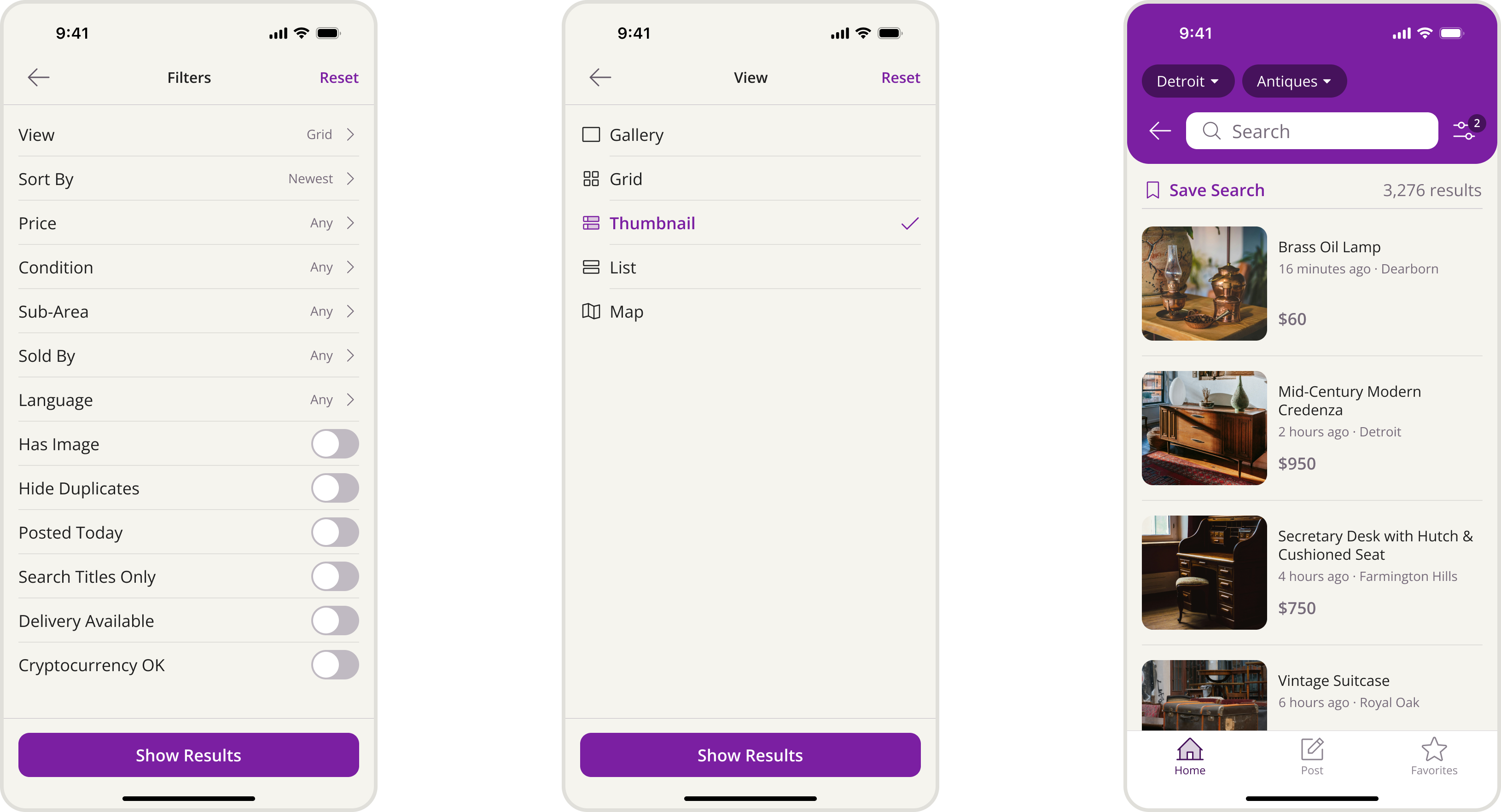
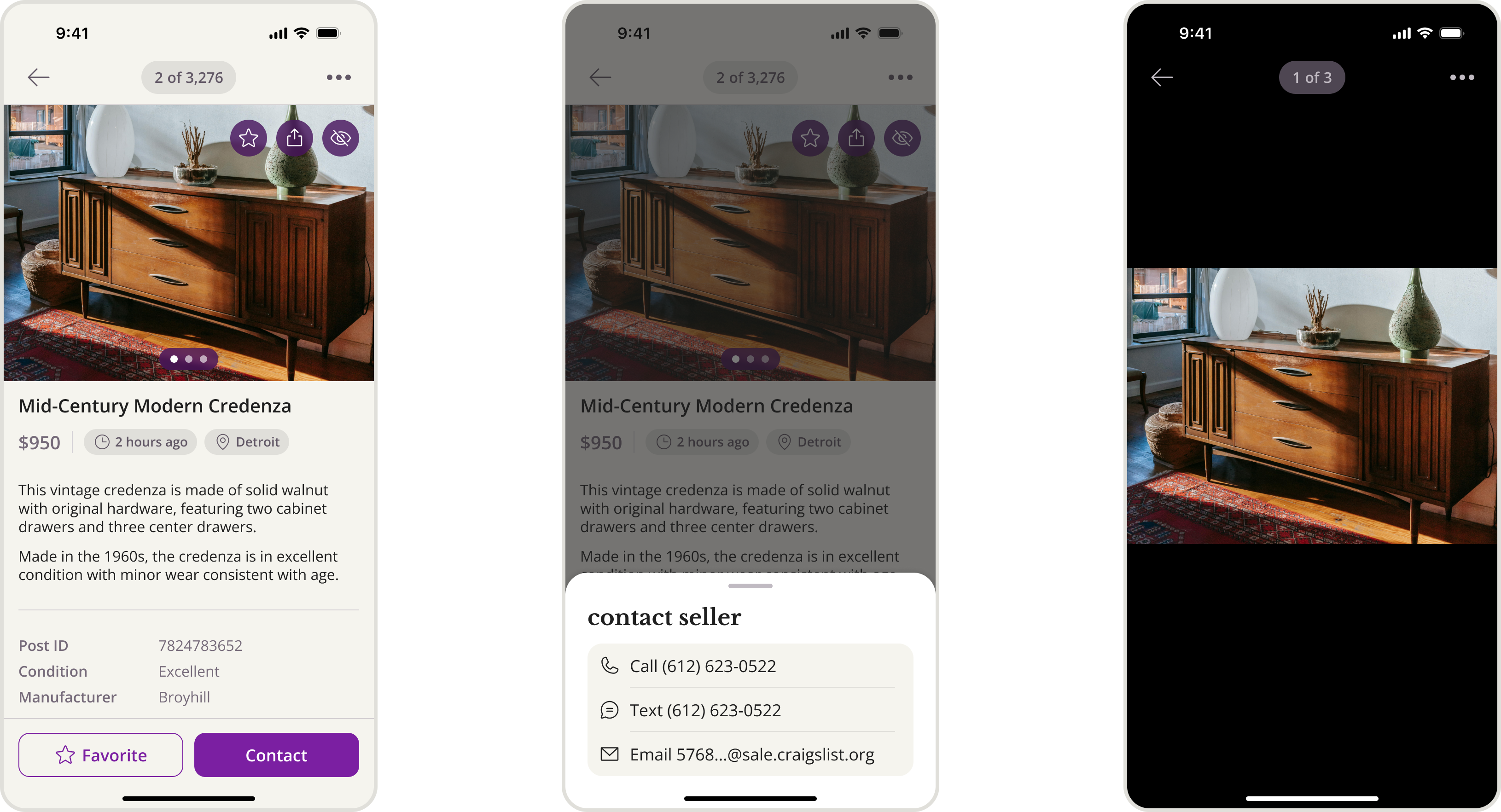
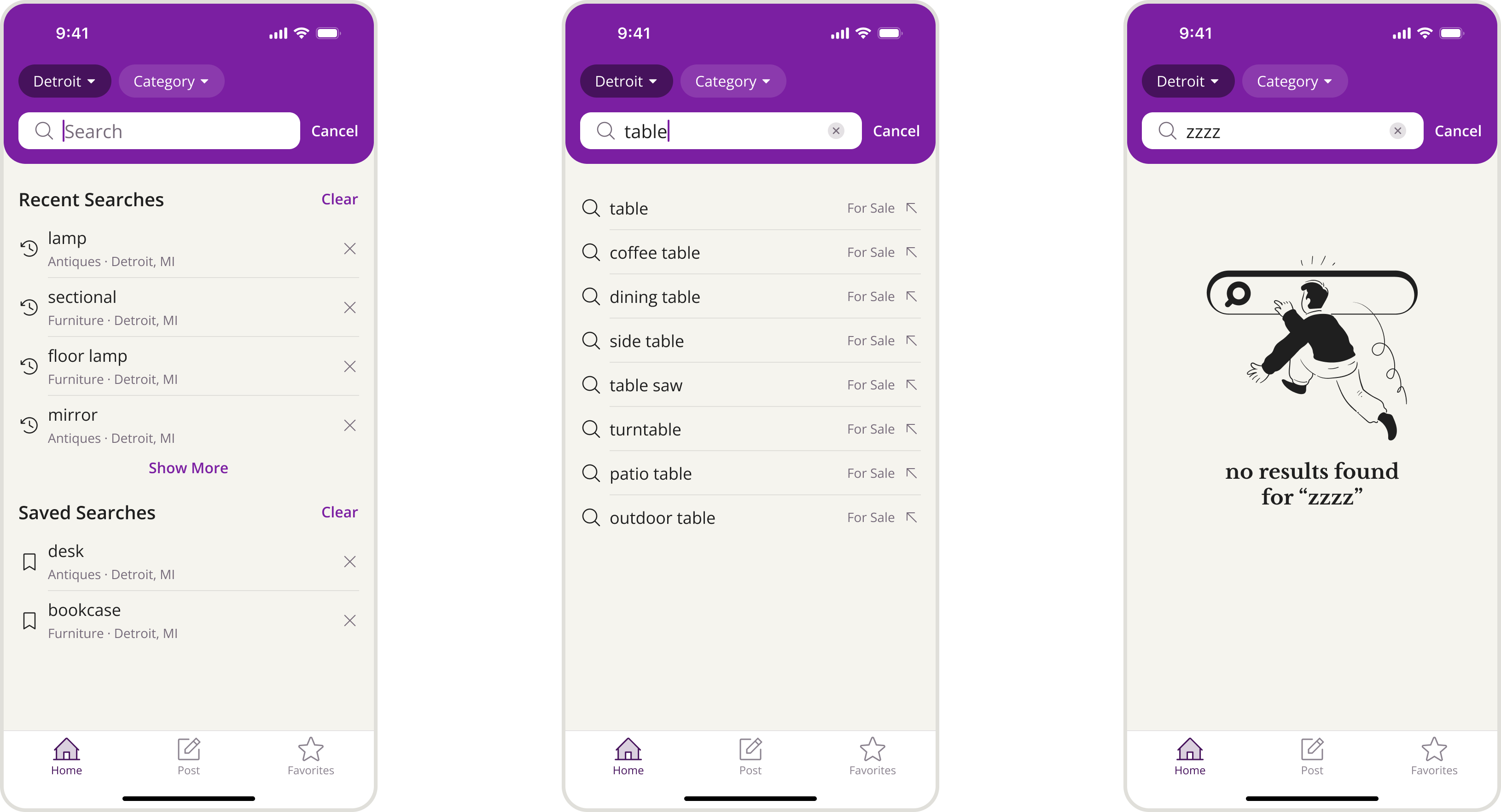
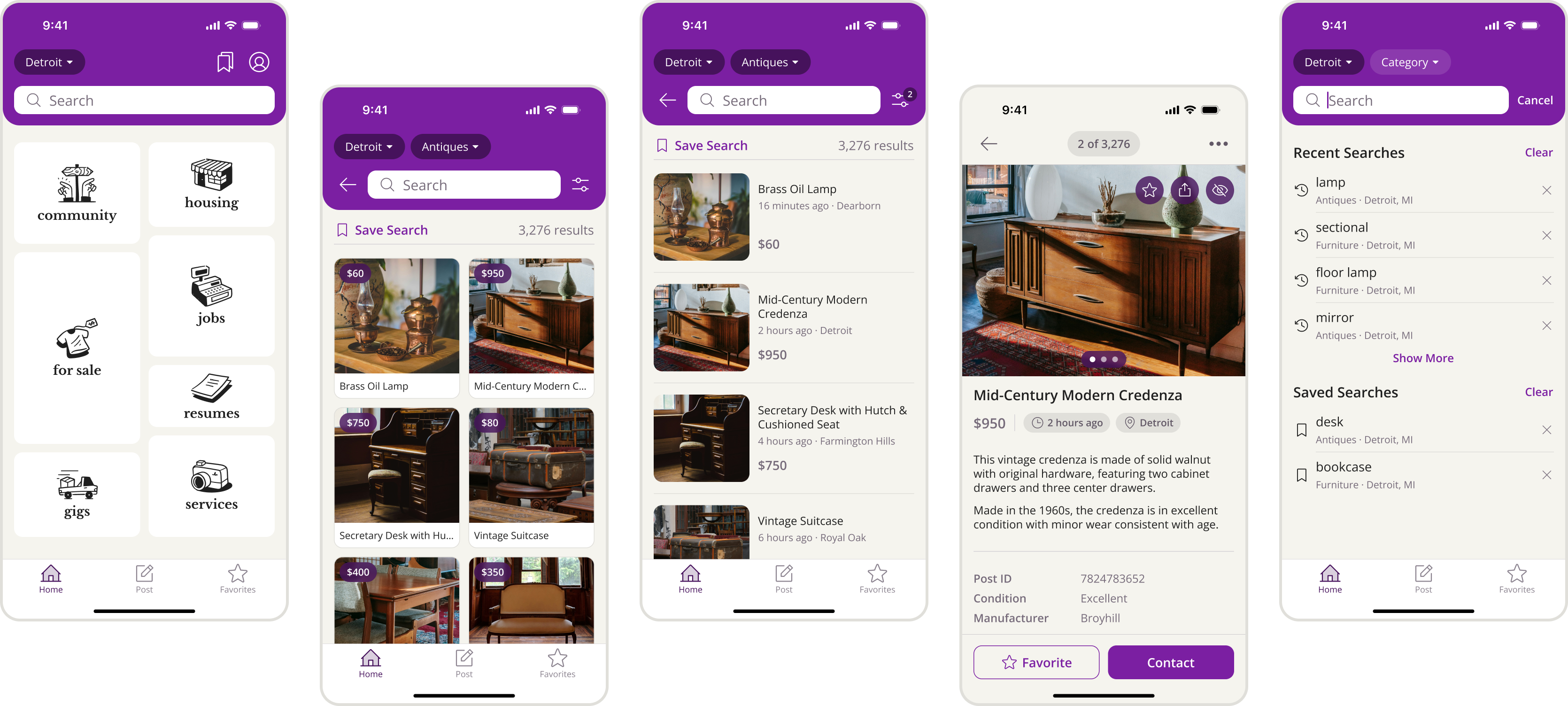
As part of a design challenge, I was tasked with designing a new mobile app experience for Craigslist that would modernize the user interface while maintaining compatibility with their existing brand identity. The scope was intentionally limited to key user flows: the home screen, browsing and searching posts, and viewing post details.
Craigslist was founded in 1995 as an email listserv by Craig Newark with the aim of connecting people to local events in the San Francisco Bay Area. The website launched in 1996, and the website interface has remained virtually unchanged over the last 30 years. Today, Craigslist remains a popular platform for posting online classifieds, connecting community members to jobs, events, items for sale, and more — with a simple guiding philosophy:
“I've learned that people want stuff that is simple and fast and gets the job done. People don't need fancy stuff. Sometimes you just want to get through the day.” — Craig Newark, Founder of Craigslist
Therefore, the primary goal of the redesign became modernizing the app experience while staying true to its simplicity, focusing on improving the usability and visual design of the app without adding unnecessary complexity.
A defining characteristic of Craigslist is its stark minimalism in the name of functionality over aesthetics, with a website that has remained remarkably unchanged since its initial launch.

Launched in 2019, the mobile app similarly embraces a simple interface without the bells and whistles of most modern apps today. This presented a unique challenge: refreshing the app experience while honoring the spirit of a brand that is defined by its resistance to modern design conventions.

To determine a design direction, I drew inspiration from newspaper classifieds as a way to visually tie the app back to the core purpose of Craigslist.

I designed a column grid resembling newspaper classifieds, sizing each card to roughly reflect the number of sub-categories in a category. The result is a home screen that feels visually appealing without becoming cluttered. Additionally, I used all-lowercase letters for display text to incorporate Craigslist's current branding.

On Craigslist, searches must be performed within a specific category, meaning users cannot search across all posts at once. As such, a usability issue with the current app is that suggested search terms don't clearly indicate which category will be searched. This becomes more problematic for potentially ambiguous search terms, such as "lawn" or "moving." A simple fix is to show the search destination alongside each suggested search term.

In the current app, recent searches lack a strong visual hierarchy. Notably, the search term itself has a secondary focus to the category and location due to its smaller text. For the redesign, I give primary emphasis to the search term by reducing the prominence of the category and location with lighter, smaller text. This better aligns with familiar patters for how users scan their search histories in other apps.


