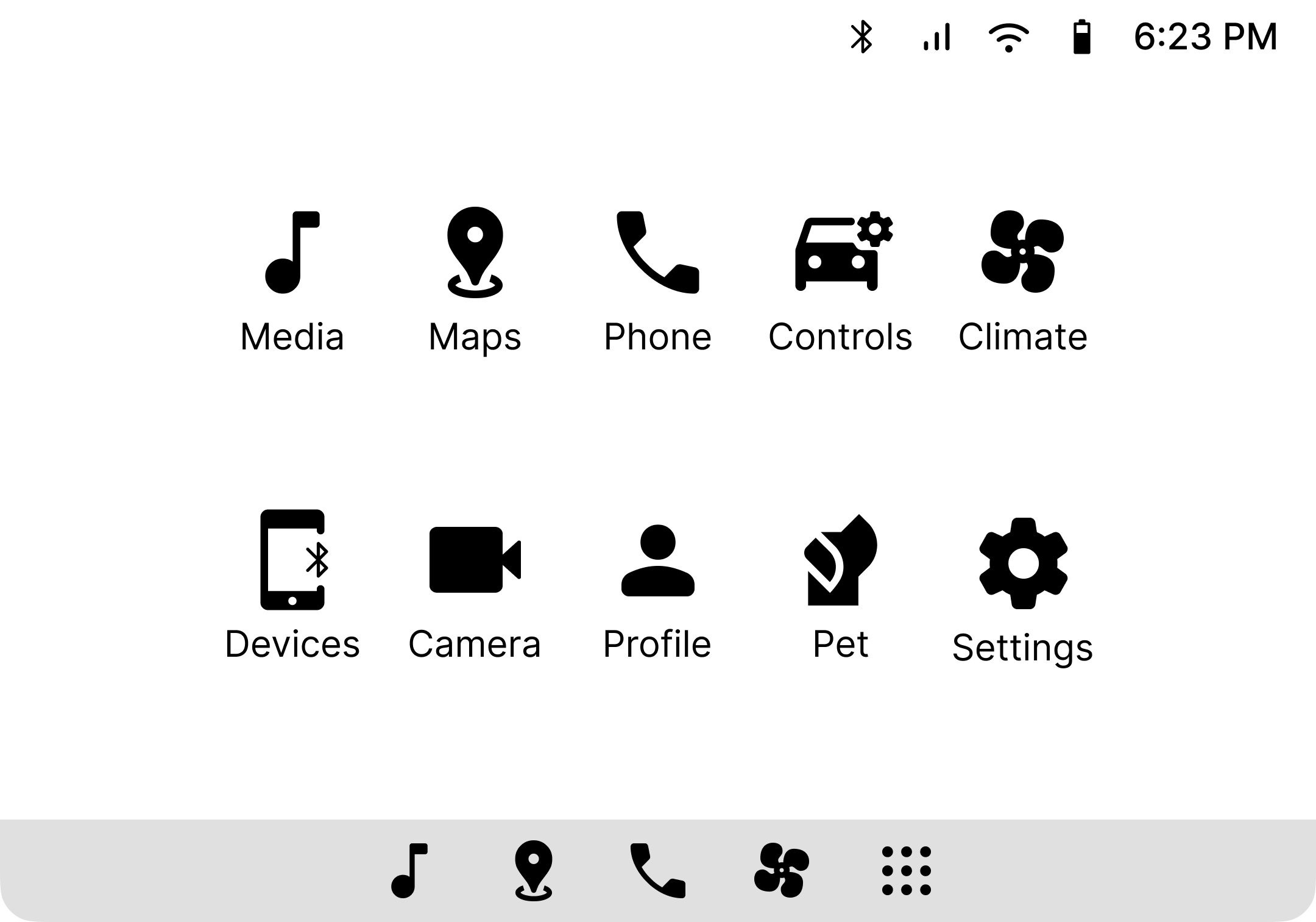
For an automotive design course, student teams were tasked with designing the screens for a luxury, performance, or mass market vehicle — culminating in a project presentation to stakeholders at General Motors. Wanting to focus on a broad customer segment, my partner and I chose to design the in-vehicle displays for a mass market vehicle.
In March 2025, I revisited this project with a fresh perspective, redesigning it to enhance the user experience and elevate the overall aesthetic. Additionally, I reworked the designs for the Chevrolet Equinox to create a more polished final product.
The designers at General Motors provided the screen specifications for the driver and center displays, defining the screen dimensions and resolution. Based on these specifications, I defined the column grid for each display to establish structure and ensure consistent alignment.
The app selector screen didn't provide a compelling experience as a landing page for the center display.
I added a home screen to provide quick access to media and navigation widgets.
I adjusted the margin and number of columns in the center display grid to improve spacing.
I added depth and visual interest through the use of gradients, opacity, and soft shadows.
I updated all designs with icons from a duotone icon library, using custom automotive icons as needed.
The screen originally designed by my partner was overcrowded with playlist options.
I redesigned the app to place a primary focus on the currently playing song and media player controls.
I added a dropdown to change the content category and incorporated shuffle and repeat controls.
The dropdown menu for the source selector includes icons to provide clear visual cues.
We received feedback that the route directions button was unclear and that the menu button could be mistaken for it.
I removed the menu button to eliminate confusion and selected a clearer icon for the route directions button.
I added a settings button and controls for adjusting the zoom level of the map.
I refined the color choices for the quick action buttons and route overview, as well as created a custom map style.
The screen I originally designed was overcrowded and lacked many vehicle controls.
We expanded the available vehicle controls and organized them into tab groups, with my partner incorporating controls for exterior lighting and driver assistance systems.
Rather than designing for a concept vehicle, I reworked the designs to align with the features and physical controls of the Chevrolet Equinox (e.g., power liftgate, rear windshield wiper, driver assistance systems). To improve usability, I replaced the toggle switches with more intuitive toggle buttons for the hood and liftgate, added info buttons for each driver assistance setting, and refined usage of the accent color to reduce visual fatigue.
The screen originally designed by my partner was overcrowded and lacked clear visual hierarchy.
We adjusted and rearranged the controls to create a stronger layout and clearer visual hierarchy.
I added driver and passenger seat visuals and placed seat-specific controls nearby, moving global controls to the bottom row to separate them from dual controls.
The interior temperature is displayed prominently to reassure passersby of the pet's safety and comfort.
I hid the navigation bar to prevent accidental input from the pet and added a settings button to adjust the temperature.
I created a dedicated screen for pet mode settings, allowing users to select a pet avatar and set a phone reminder. When a user opts to enable pet mode, safety information is displayed that warns the driver against leaving a child unattended.
We designed the home screen of a mobile app to pair seamlessly with the in-vehicle experience.
I applied the updated styling and revamped the layout to enhance focus on core controls.
This project presented excited new challenges than I had previously encountered as a designer. Historically, vehicle controls have relied on physical, tactile controls that many users still prefer. However, as more automotive companies transition to touchscreen-based controls to reduce costs, designers must translate traditionally physical controls into an intuitive digital experience. This project reinforced the importance of prioritizing usability amidst evolving industry trends, ensuring users feel confident and in control of their experience.